Imagine a team of developers and designers working on the same product but from different perspectives. This creative independence, while ideal for some, is bound to lead to chaos in the codebase. It can create inconsistencies across the product and an increasing development cost.
However, in most development teams there is usually one designer, not a team. So, if one would expect both designers and developers working together; this might not happen. This means that in the absence of a designer, many design decisions end up being made by developers, often uninfluenced by established design criteria.
This often results in every button being a little different, every selection of color a slightly different shade, and every new designer has to be spun up on dozens of tiny decisions that add up to waste. Over time, the result is a Frankenstein’s monster of mismatched components.This not only creates frustration for users but also for the teams charged with maintaining and extending the product.
What’s the solution? Of course, it’s a well-defined design system. It serves as a tool for collaboration for both developers and designers, right down to the stakeholders ensuring the product remains consistent, professional, and coherent.
In this blog post, we’ll explore what a design system is, how to create one, and why it’s such an essential tool for modern development teams. We will also provide design system examples to help you visualize the benefits and its benefits on projects.
What Is a Design System?
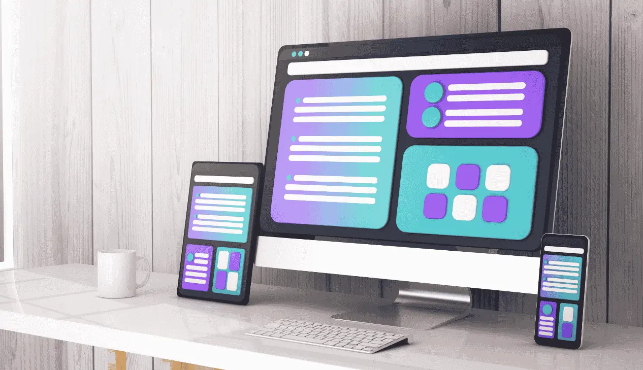
A design system is a structured approach that contains guidelines, reusable components and standards for developing and managing all digital products. It creates consistent user experience across different platforms, applications, and services.
Design systems contain design assets, such as code, documentation, and application tools. They act as a shared language that both designers and developers use to work together effectively.
It goes beyond the collection of all UI elements. It even grows as the company does or as the product evolves when it incorporates updates to branding with new visual elements and additional features.
We can conceive design systems as the backbone of any brand’s digital identity. They provide coherence, minimize redundancy, and ensure all elements share a common language with the brand’s visual.
How to Build an Effective Design System: A Unique Approach
It is important to create an effective design system in order to keep your product consistent, efficient, and maintainable. Here are some unique approaches to building a design system:
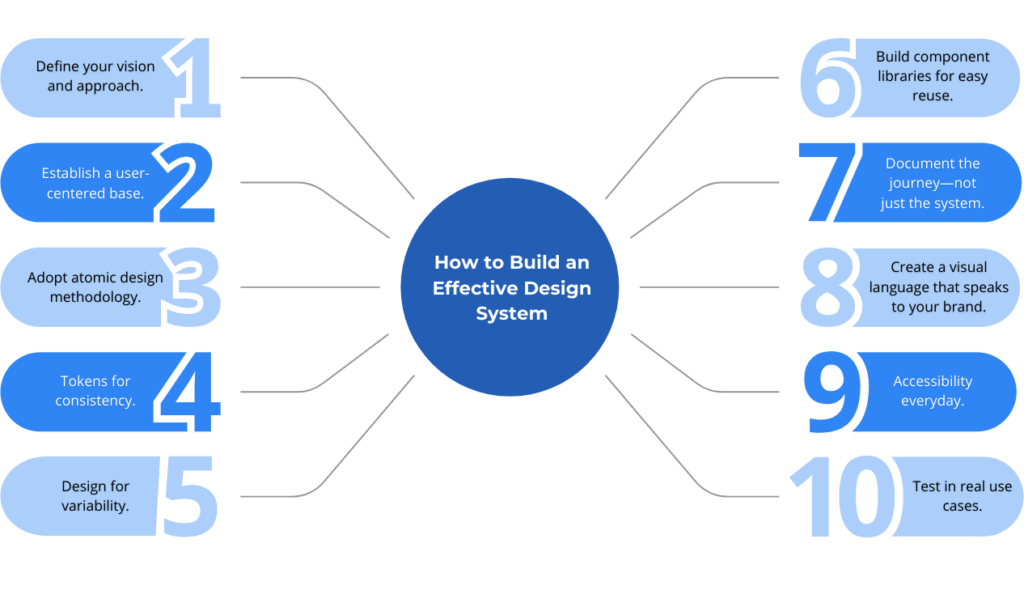
1. Define Your Vision and Approach
The first step in working on a design system is to clearly define a vision and approach. What would you want to achieve with your product’s design? A well-defined vision sets direction and creates an identity for the design system.
Ask yourself: “What kind of experience do we want to provide our users?” Clear objectives enable decisions to be made more purposefully through the process.
2. Establish a User-Centered Base
While setting up your design system, consider for whom: your team of designers, developers, and your end-users. Make sure the basis of your design system is user-centered through interviews or questionnaires conducted with your team to fully understand their needs and pain points. This helps create a real, practical design system that’s intuitive and genuinely supportive of product development.
3. Adopt Atomic Design Methodology
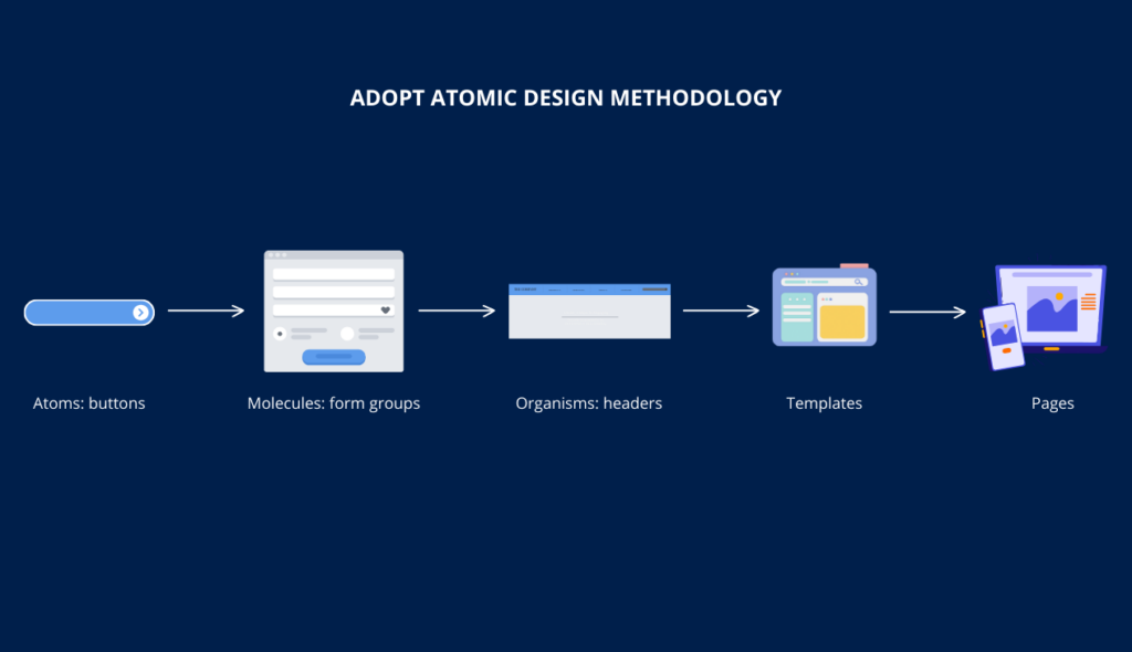
Pursue atomic design principles as the basis to build your design system. Atomic design breaks down UI components into smaller building blocks: atoms (e.g., buttons), molecules (e.g., form groups), organisms (e.g., headers), templates, and pages.
This process helps in building a modular, scalable design system where components can be combined in several ways to generate interfaces. It makes the design system future-proof and easy to maintain.
4. Tokens for Consistency
Design tokens are variables that hold information about visual styles like colors, spacing, typography, etc. They make elements look consistent across all features and platforms. They also simplify updating the visual styles of your product, as you’ll only need to update a token.
5. Design for Variability
Make the building blocks flexible and adaptable to serve various use cases. Often during a product’s evolution, a team encounters new needs and scenarios. Instead of specifying fixed components, ensure they are designed to be flexible so it will be easier to perform tweaks or extend them if needed.
6. Build Component Libraries for Easy Reuse
Develop a library of reusable components, which is quick and easy to find for designers and developers. Provide variants for different use cases, such as disabled, active, and success. Organize your components into a visual repository using Storybook, Figma, or Sketch. A well-kept component library ensures everyone has quick access to the assets they need.
7. Document the Journey—Not Just the System
Many design systems fail due to a lack of clear documentation. Document the journey, beyond just the final components and guidelines. Why were certain decisions made? What problems were solved along the way? This transparency ensures others can understand and continue to evolve the design system effectively.
8. Create a Visual Language that Speaks to Your Brand
The best design systems capture the unique visual language of the brand. What is your product’s personality? What mood or tone should it convey to users? Decide on colors, typography, icons, and illustration styles that reflect the brand. For example, Slack’s Design System uses bright colors and fun illustrations to create a friendly, approachable brand.
9. Accessibility Everyday
Make accessibility a first-class citizen in design. When creating components and guidelines, ensure you think about color contrast, font size, and navigation that a person with a disability can use. In other words, bake accessibility into every part of your design system to guarantee compliance and usability for all users.
10. Test in Real Use Cases
Before making your design system official, test it in a real-world situation. Ask designers and developers to implement features using the new system. Their feedback will help identify gaps and refine guidelines, making your design system practical and easy to adopt.
Why Is a Design System a Strategic Investment?
Although it may initially feel like a daunting task, the long-term benefits of a design system will far outweigh the work involved and make it a very strategic investment. Here are some unique advantages of having a robust design system:
Productivity Streamlined by Reusable Components
Probably the biggest advantage of a design system is efficiency. Think about it as a library from which designers and developers pull pre-built components for reuse. They don’t have to reinvent the wheel every time. Prebuilt components reduce repetition and guarantee quicker implementation for new features.
Harmonized User Experience through Consistency
A design system definitely ensures consistent user experiences. This consistency is apparent no matter how many contributors have been working on the product. IBM’s Carbon Design System demonstrates how it is possible to create consistency where various teams present a coherent view for the multi-platform presentation of a product experience. Hence, it improves trust from users and makes them reliable.
Improved Collaboration between Functions via Teamwork
Design systems are essentially the communication bridge between design, development, and product teams. It ensures everyone is working to achieve similar goals and has clarity on what’s achievable. This reduces ambiguity and makes alignment easier, thus resulting in a cohesive product experience.
Easy Scaling As Your Product Grows
With the growth of a product, it is sometimes hard to keep its look and feel consistent. Such growth will be much easier with a design system in which reusable elements and guidelines are part of the pack. A well-structured design system fully supports adding new screens, features, or modules while keeping seamless user experience
Example of a Design System
Material Design is an open-source design system from Google that provides guidelines for constructing intuitive, consistent, and attractive user interfaces across platforms and devices. It aims to create continuity in the ways people interact with physical and digital objects using familiar material properties. These includes depth, shadow, and motion.
Key Features
Components
Material Design keeps a vast library of pre-designed UI components, such as buttons, cards, app bars, navigation drawers, forms, sliders, and many more. Each component gives detailed guidelines on how to use that component, ensuring designers and developers alike understand the optimum way that each component should be used.
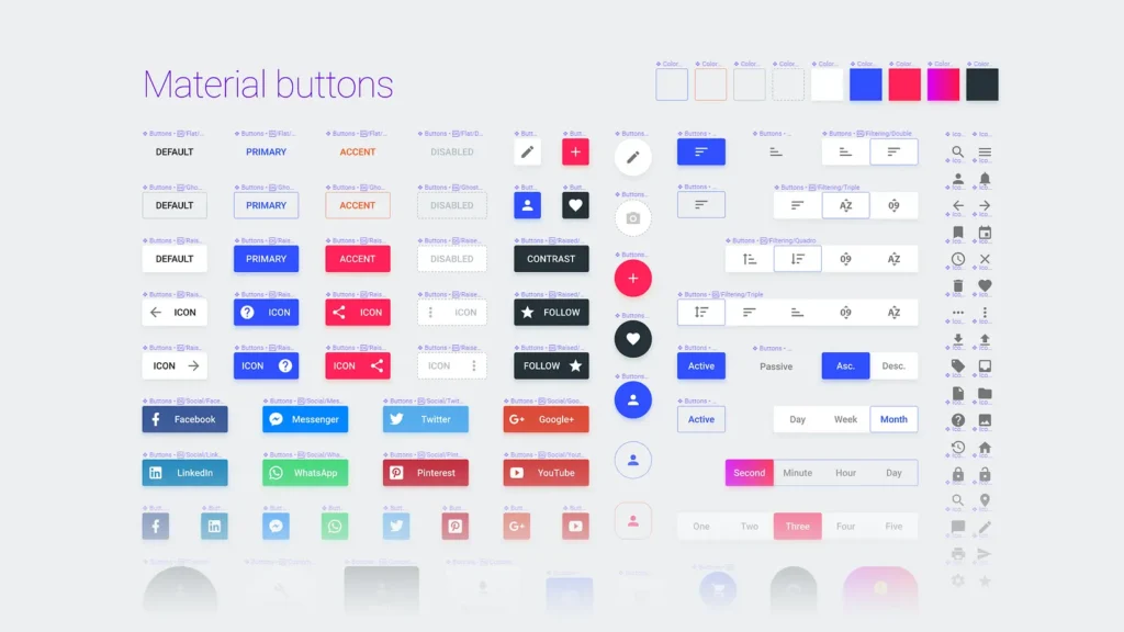
Source: Medium
Theming
Material Design’s theming features strong tools for adapting and customizing elements of the design to conform to particular brand identities. The theming system allows for color palettes, typography, shapes, and elevation styles to be customized in order to create a look and feel representative of the brand identity while still following core principles behind Material Design. Further still, Google even provides the Material Theme Builder, which will let designers play around visually with themes and export the results for easy implementation.
Directions
To support consistent and best design practices, Material Design keeps an extensive library of guidelines on layout, color usage, typography, motion, interaction, and more on every aspect of UI/UX design.
Motion and Interaction
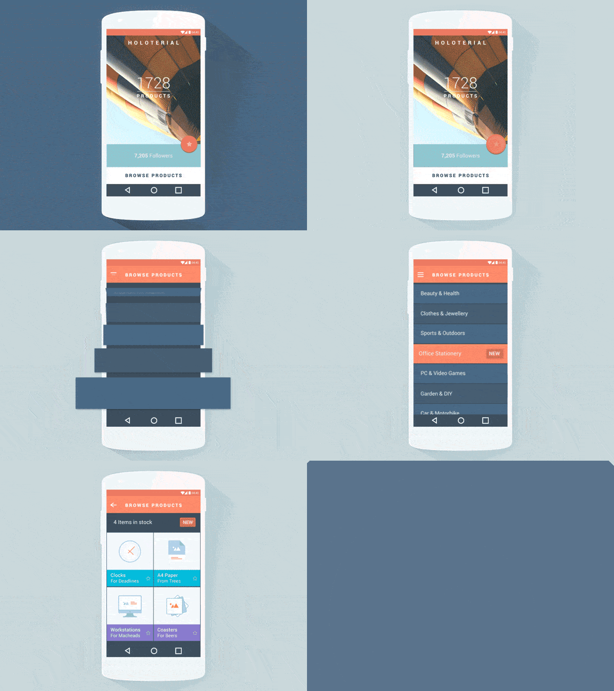
Core to Material Design is its focus on motion that conveys meaning and enhances usability. Meaningful animations in the context of Material Design are purposeful and direct attention to the core areas of the interface. The meaningful concept of motion makes sure transitions and animations enhance user interaction but do not overwhelm users. Elements move and interact in ways that reinforce physical properties, create hierarchy, depth, and continuity within a user’s journey.
Source: Agilie
Conclusión
It’s hard to emphasize the value of a design system. With this upfront effort, you ensure future savings of money and time, not to mention consistency for your product. Whether you’re working with a large team or just a few freelancers, a well-designed system can streamline development, maintain brand identity, and generally improve product quality.
A design system is not static, it evolves with your product. It will always need updating and will be subject to ongoing iterations. In this way, it will continue being a cost-effective and positive tool for your organization.
Investing in a design system pays off big time in the long run. It’s a means of process optimization that helps to keep your product scalable, professional, and consistent.
If your team follows agile principles and seeks flexibility and continuous improvement, our content on how agile methodologies impact customer experience could provide you with more relevant information.


